Editing is where photographs become photographs. The camera records data; the edit reveals intention. In 2025, software is faster and smarter than ever, but a clear process beats any tool. Here’s my step-by-step workflow that keeps colors natural, skin tones elegant, and delivery consistent whether the job is a portrait session, an editorial, or an event.
Import and cull: I ingest to a dated folder structure with a mirrored backup. On import, I apply a neutral camera profile and a baseline preset that includes lens corrections, gentle contrast, and a subtle S-curve. Culling happens in rounds: first star anything with potential, then promote the best frames to picks. This two-pass approach keeps me decisive and prevents “maybe” images from clogging the edit.
White balance and exposure: I start global. I set white balance using a neutral reference in the scene (skin, gray clothing, clouds) and fine-tune by eye for mood. If skin looks green or magenta, I nudge tint instead of temperature. Exposure comes next: protect highlights, then lift shadows just enough to feel dimensional. I avoid crushing blacks — a bit of shadow texture keeps skin lifelike.
Color management: I work inside a wide-gamut space (Display P3 when possible) and soft-proof only at export. HSL is where the magic happens. I desaturate orange slightly and shift it a hair toward red for richer skin, reduce saturation in greens to keep foliage from stealing attention, and add a hint of blue to shadows for a subtle filmic coolness. I’m careful: if I can “see” the grade, it’s probably too heavy.
Local adjustments: I dodge and burn with large, feathered brushes at low flow. The goal is sculpting, not spotlighting. I brighten the mask under the eyes a touch, deepen the jawline shadow, and lift cheek highlights by a third of a stop. I also use radial filters to add micro-contrast to the face while gently softening the periphery, steering the eye without obvious vignettes.
Skin and texture: For portraits, I keep texture natural. I reduce clarity slightly on skin and bring it back on hair, brows, and clothing. If a blemish will be gone in a week, I remove it. If it’s part of the person, I soften it only enough to avoid distraction. Frequency separation has its place for close-up beauty work, but for most sessions, careful healing and subtle micro-dodging preserves authenticity.
Sharpening and noise: I sharpen at the end, masking heavily so skin remains smooth while edges pop. Noise reduction is gentle; I prefer clean capture to aggressive smoothing. If the image is pushed at high ISO, I’ll add a touch of film grain to unify texture — a creative choice that hides noise behind a consistent layer rather than fighting it.
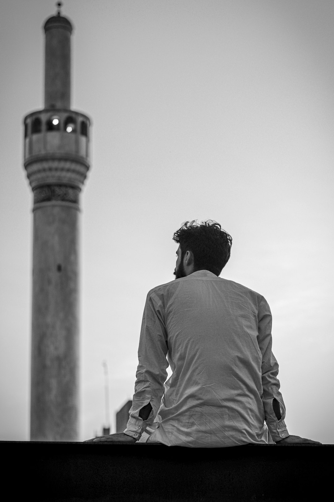
Black and white: For monochrome sets, I convert using a profile that protects highlights and deepens midtones. I adjust the luminance of reds and yellows to shape skin, then introduce a mild cool tint to shadows. A strong black and white needs separation: ensure the subject is brighter than the background or vice versa, and let the geometry carry the frame.
Consistency and delivery: I build collections based on usage (press, social, print) and create export presets with the right color space and sharpening for each. Social gets sRGB, moderate sharpening, and 3000px on the long edge. Print masters stay in a wide gamut with minimal compression. I include a small contact sheet PDF for clients who prefer a quick overview.
The heart of this workflow is restraint. Software will always tempt you with more saturation, more clarity, more “pop.” But timeless edits rarely scream; they breathe. If you want your work to age well, let color be honest, let skin be skin, and let your choices serve the story first, the sliders second.